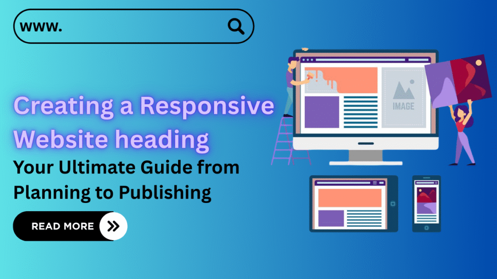
Capturing your audience’s attention in today’s digital world isn’t easy. With thousands of businesses already competing online, users are quick to click away if your site doesn’t impress them instantly. It’s not just about having a website anymore it’s about creating a responsive website that feels effortless to navigate on any device. If your site doesn’t look right on a phone or takes too long to load, chances are your visitors are heading straight to your competitor.
Whether you’re building a brand-new site or revamping an old one, creating a responsive website ensures your content looks great and functions flawlessly on desktops, tablets, and smartphones. It’s not just about aesthetics it’s about delivering a consistent, user-friendly experience that keeps visitors engaged and coming back for more, no matter what device they’re using.
So how do you create a site that looks sharp and performs seamlessly across all screen sizes?
In this article, we’ll guide you step-by-step through the process of designing a website that’s not only visually appealing but also practical, efficient, and fully responsive. From choosing the right tools and platform to formatting your pages for peak performance, you’ll learn how to create a website that works for you 24/7.
1. Define the Purpose and Objectives of Your Website
Before diving into design or picking a fancy template, take a step back and ask yourself: Why am I creating this website, and who is it for? One of the biggest mistakes beginners make is jumping straight into development without a clear vision. Every website has a purpose, and understanding that purpose is the foundation of creating a responsive website that actually delivers results.
Common Website Goals Might Include:
- Attracting new clients – turning your site into a lead-generating machine (for services, consultations, or quote requests).
- Selling products – launching a full-scale eCommerce store.
- Boosting brand image – great for companies, startups, or personal portfolios.
- Informing or educating – perfect for blogs, online courses, or news sites.
- Customer support & interaction – forums, FAQs, or help desk pages.
How to Set Clear, Actionable Objectives:
- Grow customer inquiries by 30% within three months
- Showcase your portfolio and completed projects professionally
- Build an email list through newsletter sign-ups
- Strengthen your brand presence in your industry
Clearly defined goals will help guide the structure and functionality of your site. They ensure you’re not just creating a responsive website that looks good but one that actually serves real user and business needs.
2. Choose the Right Platform and Website Builder
Selecting an appropriate platform is a critical step when creating a responsive website. The platform you choose will directly impact your site’s functionality, performance, scalability, and ease of use. With numerous options available from drag-and-drop builders to advanced content management systems (CMS), it’s important to choose from the best website builders for WordPress that align with your specific goals, technical experience, and budget.
Key Factors to Consider:
- eCommerce Capabilities:
If your primary goal involves selling products or services online, opt for a platform that supports secure and scalable online store functionalities. - SEO Features:
Ensure the platform allows access to key SEO settings, such as editing meta tags, customizing URLs, optimizing speed, and integrating with analytics tools. - User Experience & Technical Skill:
For beginners, website builders like Wix or Squarespace offer user-friendly interfaces with minimal setup. For more control and flexibility, CMS platforms like WordPress are ideal for users with basic to advanced development skills. - Budget Considerations:
Free platforms may be appealing initially but often come with limitations in design, storage, or features. Paid solutions provide greater customization, support, and long-term scalability.
By evaluating these aspects carefully, you can choose a platform that supports both the technical demands and strategic objectives of creating a responsive website.
3. Overview of Popular Website Platforms

It’s important to understand the strengths and limitations of the most commonly used platforms. Each comes with its own set of features, making it suitable for different types of projects depending on your goals, technical skills, and preferred level of control.
WordPress (wordpress.org)
Type: Open-source CMS
Best for: Blogs, business websites, eCommerce (with plugins like WooCommerce)
Pros: Highly flexible, SEO-friendly, thousands of themes and plugins
Cons: Requires separate hosting and some technical knowledge
Ideal for: Users looking to build a scalable and fully customizable website with long-term growth in mind
Wix
Type: Drag-and-drop website builder
Best for: Portfolios, landing pages, small business websites
Pros: Intuitive visual editor, fast setup, modern templates
Cons: Limited SEO capabilities, complex to migrate later
Ideal for: Beginners who want to get online quickly with minimal setup
Squarespace
Type: Premium website builder
Best for: Creative portfolios, design-focused websites, boutique online stores
Pros: Sleek design templates, reliable performance, user-friendly
Cons: Higher cost, limited flexibility for advanced customization
Ideal for: Creatives or businesses that value polished aesthetics and simplicity
These platforms offer various levels of control, customization, and scalability. Choosing the right one is a key step in creating a responsive website that not only looks professional but also aligns with your technical comfort level and business needs.
4. Choosing a Domain Name

A domain name is more than just the web address of your site it’s a core element of your brand identity. It shapes the first impression visitors have, builds trust, and even influences your visibility in search engine rankings. When creating a responsive website, selecting the right domain name helps you stand out in a crowded market and makes your site easier to recall.
4.1 Principles for Selecting an Effective Domain Name
When choosing a domain, it’s important to keep a few essential criteria in mind:
- Brevity – Short domain names are easier to remember and quicker to type.
- Simplicity – Avoid using complicated words, special characters, or numbers that could confuse visitors.
- Brand Alignment – Your domain should reflect your business, services, or professional niche.
- Relevant Keywords – Including a relevant keyword (like “design,” “studio,” or “solutions”) can support your SEO strategy and make the domain more intuitive.
- Uniqueness – Always verify that your domain isn’t already in use or infringing on trademarks. A unique name protects your brand and avoids legal complications.
Examples:
- Good:
designhub.dev,eco-cleaning.com,mycoach.online - Bad:
best-websitetemplates2.biz
Choosing the right domain name from the start is a foundational step in creating a responsive website that’s both brandable and optimized for long-term growth.
4.2 Choosing a Domain Extension
The domain extension also known as a top-level domain (TLD) is the part that comes after the dot, such as .com, .net, or .tech. While often overlooked, the extension you choose can influence how your website is perceived by users and search engines alike. It can also provide context about your site’s purpose or audience.
Common Types of Domain Extensions:
- .org, .net – Widely recognized and suitable for a broad, international audience.
- .shop, .store – Ideal for eCommerce websites, clearly indicating a shopping or retail focus.
- .news, .pro, .tech – Useful for content-specific or professional platforms, adding thematic relevance.
- .adult, .webcam – Reserved for age-restricted or niche content, and should be used with care depending on the audience.
Professional Tip:
If your website targets an international audience, it’s a good idea to register multiple versions of your domain name with different extensions. This helps protect your brand identity and prevents others from misusing or duplicating your domain across other TLDs.
Selecting the right domain extension is a small but essential detail in the overall process of creating a responsive website that’s credible, relevant, and well-positioned for growth.
4.3 Using Your Own Domain for a Professional Presence
Choosing a custom domain and subdomain name over a free subdomain (such as yourname.wixsite.com) demonstrates professionalism and a long-term commitment to your online presence. For anyone creating a responsive website aimed at attracting clients, generating leads, or building a trustworthy brand, having your own domain is a fundamental step.
Key Benefits of Owning a Domain:
- Builds Trust – Visitors are more likely to trust a website with a custom domain, especially when making purchases or sharing personal information.
- Improves SEO – Search engines tend to index websites with custom domains more effectively than free subdomains.
- Professional Email Addresses – Using an address like
info@yourdomain.comadds credibility and reinforces your brand image. - Supports Brand Identity – A dedicated domain helps establish consistency and recognition across all digital platforms.
Using your own domain not only improves the appearance of your website but also strengthens the foundation for growth and user confidence key factors in creating a responsive website that performs well in both function and reputation.
5. Plan the Website Structure
Website structure is more than just placing pages in order; it’s the backbone of your entire site. A thoughtfully planned structure improves navigation, supports user engagement, and plays a key role in SEO performance. When creating a responsive website, your structure directly influences how easily visitors can find information and take meaningful actions, whether that’s making a purchase, filling out a form, or subscribing to a newsletter. Using a reliable landing page maker can simplify this process, helping you design pages that guide users smoothly toward conversion.
What Your Website Structure Should Include:
- Primary and secondary content sections
- Clear page hierarchy (parent and child pages)
- Organized navigation menus and dropdowns
- Internal linking between relevant pages
- Descriptive and SEO-friendly URLs
Why Structure Matters:
- For Users: A clean, logical layout makes it easier to navigate and find key information without frustration.
- For SEO: A well-structured website is easier for search engines to crawl and index, improving rankings.
- For Business Goals: An intuitive structure keeps users engaged and guides them toward conversions be it sign-ups, product purchases, or service inquiries.
Core Principles for Designing an Effective Structure:
Simplicity and Logic
Keep the structure intuitive. Visitors shouldn’t have to think they should be able to find. Avoid over-nesting. For example:
-
Home → Services → SEO Promotion -
Home → Company → Services → Website Promotion → SEO → Audit
Purpose-Driven Pages
Each page on your site should serve a specific function: to inform, convert, sell, or support.
Support the Customer Journey
Guide visitors along a natural path. For example, if they land on a blog post about web design, provide a clear path to your related design services page.
SEO Optimization Tips
- Include relevant keywords in URLs (e.g.,
yoursite.com/restaurant-website-design) - Use internal links to connect your blog, services, and case studies
- Create dedicated pages for important search queries to improve visibility
Pro Tips for Planning:
- Start with a rough sketch or outline on paper
- Use mind mapping tools like Miro or XMind for visual organization
- Analyze competitor websites to identify structure gaps
- Always design with mobile users in mind prioritize easy menus, collapsible navigation, and accessible “Back” options
Creating a responsive website that’s easy to navigate begins with smart structural planning. This ensures your visitors get where they need to go quickly and confidently.
6. Create a Sitemap
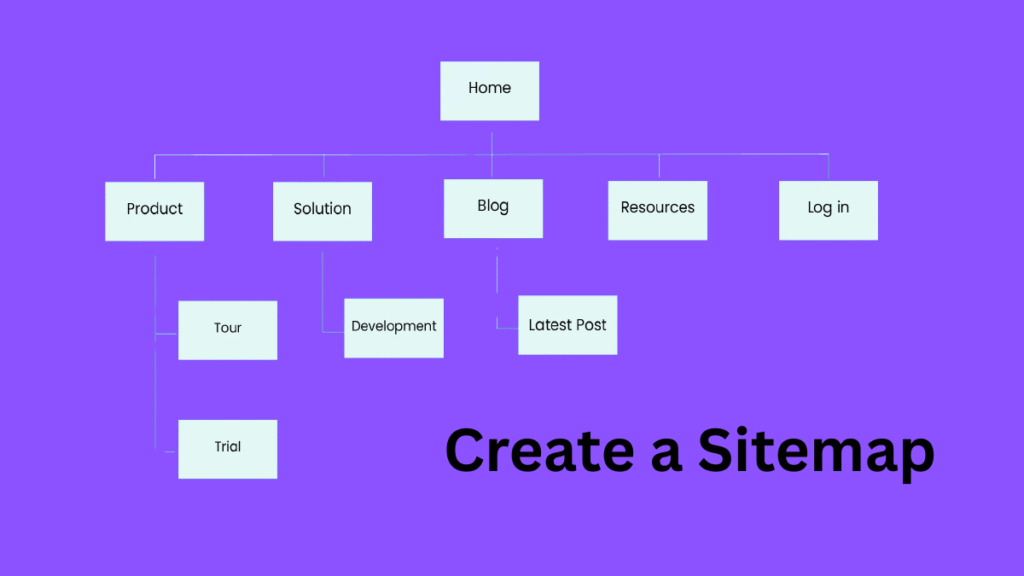
A sitemap is a blueprint of your website’s structure, showing how all the pages are connected. It’s an essential tool for both planning your site and optimizing it for search engines. Whether you’re just starting or fine-tuning your responsive design, using well-structured responsive web design templates and building a sitemap ensures that your site remains organized and easy to navigate for both users and search engines.
Types of Sitemaps
There are two main types of sitemaps, each serving a different purpose:
- Visual Sitemap (UX Map): Designed during the planning phase to outline page structure and navigation paths for users.
- XML Sitemap: Created post-launch for search engines, helping bots index your pages efficiently.
Benefits of a Visual Sitemap:
- Provides a clear understanding of the website layout before development begins
- Helps align teams and stakeholders on structure and navigation
- Highlights disconnected or redundant pages
- Assists in building user-friendly menus and navigation flows
Benefits of an XML Sitemap:
- Accelerates the indexing process
- Supports SEO by providing search engines with page hierarchy
- Allows control over which pages are visible to crawlers
- Includes update timestamps to signal fresh content
What to Include in a Visual Sitemap
- Main Pages: Homepage, About, Services, Contact
- Subsections: Product or service pages, case studies, testimonials
- Blog Structure: Blog overview → Categories → Individual Posts
- Landing Pages: Special offers, campaigns, or advertising-specific pages
- System Pages: 404 page, privacy policy, terms and conditions
Recommended Tools for Visual Sitemaps

- Octopus.do: Great for quick planning and visual UX mapping
- GlooMaps: Simple browser-based tool for fast sitemap creation
- FlowMapp: Designed for UX professionals mapping user journeys
Pro Tip: Use color codes to differentiate sections (e.g., blue for core pages, gray for subpages, red for system pages).
What Is an XML Sitemap and How to Build It
An XML sitemap is a file (usually at yourdomain.com/sitemap.xml) that lists all the URLs on your site intended for indexing. It ensures that search engines don’t miss important pages especially on larger websites.
Include in Your XML Sitemap:
- Homepage and essential internal pages
- Blog articles and category pages
- Product or service pages
- Dynamic content that’s crawlable and useful
Exclude:
- Duplicate content
- Admin or user-only sections
- Incomplete or unpublished pages
How to Create an XML Sitemap:
- WordPress: Use plugins like Yoast SEO, Rank Math, or All in One SEO
- Wix/Squarespace: Usually generated automatically
- Other Tools: Use online generators like XML-Sitemaps.com or software such as Screaming Frog
Creating a responsive website starts with building solid structural foundations. One key step is using an XML sitemap create WordPress to help search engines crawl your site efficiently and improve your overall SEO, while also ensuring users enjoy a smooth navigation experience.
7. Develop a User-Centric Layout
The layout of your website is the first thing users notice and often the deciding factor in whether they stay or leave. A user-centric layout prioritizes the needs, behaviors, and preferences of your audience, rather than the convenience of the developer or assumptions of the business owner. It ensures that your design encourages interaction, drives conversions, and improves user satisfaction.
Core Principles of a User-Friendly Interface
7.1 Understand Your Target Audience
Different user groups have different expectations. Tailoring your layout to their habits and preferences increases engagement and trust.
- Younger users may prefer fast-loading pages, dynamic visuals, minimal text, and accessible contact forms or live chats.
- Professional or B2B users often look for organized layouts, clear value propositions, and detailed content that supports informed decisions.
7.2 Establish a Clear Visual Hierarchy
Good layout design guides the user’s eye to key information and actions.
- Use large, bold headings to structure your content
- Highlight calls-to-action (CTAs) with contrasting colors
- Ensure that buttons, icons, and labels clearly indicate their purpose
A clear hierarchy improves readability and helps users understand what to do next.
7.3 Simplify Navigation
Navigation should be straightforward and accessible on every page.
- Keep menu labels short and self-explanatory (e.g., use “Services” instead of “What We Offer”)
- Place the navigation bar in a familiar location typically at the top or side
- Limit the number of menu items to avoid overwhelming users
The goal is to reduce friction and make it easy for visitors to find what they need in just a few clicks.
7.4 Maintain Consistency Across Pages
A consistent layout and style throughout your website builds trust and creates a more seamless experience.
- Use uniform button styles, typography, spacing, and form layouts
- Stick to a cohesive color palette and iconography
- Maintain consistent positioning of elements like CTAs, breadcrumbs, and footers
Visual consistency improves usability and reduces the learning curve for users.
7.5 Prioritize Mobile Responsiveness
With the majority of web traffic now coming from mobile devices, responsive design is no longer optional.
To ensure your layout works well on all screen sizes:
- Use larger, touch-friendly buttons
- Implement a collapsible menu (hamburger menu)
- Avoid clutter opt for a simplified version of the desktop layout on mobile
- Test your site on multiple devices and resolutions
Creating a responsive website layout that adapts gracefully to different devices helps you reach and retain a wider audience.
8. Basic Design Principles: Simplicity and Use of White Space
Good website design is not just about how it looks it’s about how effectively it guides users to take action. Simplicity and the thoughtful use of white space are essential elements of modern web design that improve usability, readability, and overall user experience.
The Principle of Simplicity
Simplifying your design ensures users aren’t overwhelmed and can quickly focus on what matters. Every element on the page should serve a purpose.
- Eliminate clutter — remove visual elements that don’t contribute to the user journey.
- Highlight primary actions — such as filling out a form, making a purchase, or clicking through a service page.
- Use intuitive navigation — clear icons, well-structured menus, and recognizable button styles promote ease of use.
- Limit distractions — avoid using too many colors, fonts, or decorative graphics that don’t support the core message.
Simplicity enhances engagement by keeping users focused on their goals.
Understanding White Space
White space also known as negative space is the empty area between elements on a page. It’s not wasted space; it’s a powerful design tool.
- Creates visual hierarchy — separating sections clearly helps users prioritize content at a glance.
- Improves readability — generous spacing around text blocks and headings makes information easier to process.
- Draws attention to key elements — an isolated call-to-action button surrounded by space naturally attracts more clicks.
- Contributes to a clean, modern aesthetic — giving the design room to “breathe” elevates professionalism.
Tips for Structuring a Clean Visual Layout
- Use a grid system to maintain balance and alignment across elements.
- Limit fonts to one or two and ensure contrast between headings and body text for readability.
- Reserve accent colors for interactive elements or important highlights like CTAs.
- Maintain consistency in block positioning, spacing, and visual rhythm This reinforces trust and makes the design feel intentional.
A clean, user-centered design built on these principles makes your website more effective and enjoyable to use.
9. Creating Prototypes and Wireframe Structures
Prototypes and wireframes are essential tools in website planning. They provide a clear visual layout of your website’s structure before any design or development begins. These early-stage mockups help streamline communication, reduce revisions, and improve efficiency during production.
What Is a Prototype?
A prototype is an interactive draft of a future website. It outlines the layout, content flow, and user actions. Prototypes simulate how a user will interact with the interface, offering an early opportunity to identify improvements.
What Is a Wireframe?
A wireframe is a low-fidelity sketch that represents the page structure without colors, images, or branding. It shows the placement of key elements such as:
- Headers and footers
- Navigation menus
- Buttons and forms
- Image placeholders
- Text blocks
Think of it as the blueprint of a building functional and structural, not decorative
Creating wireframes and prototypes helps to:
- Validate the structure before investing in design
- Facilitate feedback from clients or stakeholders early in the process
- Minimize redesign costs by catching issues early
- Improve collaboration between designers, developers, and project managers
These drafts serve as communication tools that align vision and expectations.
Popular Tools for Wireframing and Prototyping
| Tool | Key Features |
|---|---|
| Figma | Free and browser-based; supports both wireframes and interactive prototypes. Great for real-time team collaboration. |
| Balsamiq | Focused on quick wireframes with a hand-drawn look. Simple interface for fast planning. |
| Adobe XD | Allows detailed interactive prototypes and integrates smoothly with Adobe Creative Cloud. |
| Moqups | Web-based platform with pre-made UI elements ideal for quick layouts and mockups. |
| Axure RP | Advanced prototyping with support for logic, conditions, and complex interactions. |
Tip: Use grayscale during wireframing to keep the focus on layout and functionality, not design elements.
10. Gathering and Creating Engaging Content
Content is the core of your website’s communication. It’s not limited to just text it includes everything that conveys value to your audience: images, videos, icons, buttons, and headlines. Effective content builds trust, encourages interaction, and ultimately drives conversions.
Types of Content to Prepare
Text Content
- Service and Product Descriptions
Ensure they are unique, clear, and highlight the benefits. - Blog Articles
Offer useful information, improve SEO, and establish credibility. - Headings and Subheadings
Create a clear information hierarchy that improves readability. - Calls to Action (CTAs)
Use action-oriented prompts like “Book a free consultation” or “Download the checklist” to guide users.
Visual and Multimedia Content
- High-Quality Images
Use optimized visuals that support your message without slowing down the site. - Videos
Short videos explaining services, showing behind-the-scenes, or featuring client testimonials can increase engagement. - Infographics
A great way to simplify and present complex data visually.
Social Proof and Trust Elements
- Customer Testimonials
Real feedback helps build credibility. - Case Studies
Showcase your work and highlight results. - Client Logos
Display partnerships or past clients to reinforce your reliability.
Content That Solves User Problems
- FAQs
Address common concerns upfront and reduce support inquiries. - Guarantees and Policies
Clearly state what users can expect, boosting confidence in your services. - Guides and How-Tos
Offer practical advice that positions your brand as helpful and knowledgeable.
Content Creation Tips
- Focus on user value aim to inform, assist, or solve a problem.
- Use a conversational and transparent tone that’s easy to read.
- Incorporate keywords naturally to support SEO without sacrificing clarity.
- Avoid overly promotional or generic language authenticity resonates more with visitors.
11. Establishing a Brand Style: Colors, Fonts, and Images
A clear brand style makes your website recognizable, trustworthy, and visually consistent.
Colors
- Use 2–3 main colors: base, accent, and background.
- Match color with emotion:
Blue = trust, Green = safety, Red = urgency. - Tools: Coolors, Adobe Color, Paletton.
Fonts
- Limit to two: one for headings, one for body text.
- Use readable, web-safe fonts (preferably sans-serif).
- Ensure fonts scale well across devices.
Images
- Use original or high-quality visuals.
- Keep them relevant and optimized (WebP, SVG).
- Maintain one visual style throughout the site.
Visual Consistency is Key
Create and follow a brand style guide (or brand book) to ensure future content stays aligned with your established look and feel
Maintain the same visual style for all elements icons, buttons, illustrations, and section layouts
12. Mobile Optimization
Mobile optimization is no longer optional it’s a standard. With over 60% of website traffic coming from smartphones, your site must be designed with mobile users in mind from the very beginning.
Principles of Mobile-First Design
1. Flexible Grid Layout
- Design your site using a responsive grid that automatically adjusts to different screen sizes from large desktops to small phones.
2. User-Friendly Navigation
- Use a hamburger menu to simplify the navigation bar.
- Ensure large, tappable buttons for easy interaction.
- Simplify the interface by reducing clutter and prioritizing essential elements.
3. Cross-Device Testing
- Test how your site appears and functions on various devices:
- Chrome DevTools for real-time previews
- BrowserStack, Responsively App, or similar platforms for cross-browser/device testing
4. Optimized Images and Fonts
- Compress images to reduce load time without sacrificing quality.
- Use lightweight fonts that load quickly.
- Implement lazy loading to defer off-screen content.
5. Page Loading Speed
- Eliminate unused or excessive JavaScript and CSS.
- Use a Content Delivery Network (CDN) to improve global loading performance.
Common Mobile Optimization Mistakes to Avoid
- Text too small to read comfortably
- Buttons or links too close together, making them hard to tap
- Horizontal scrolling, which disrupts user experience
Tip: Always start your design process with mobile screens in mind and scale up this ensures the most important content is prioritized and easily accessible on all devices.
13. Implementing SEO Strategies to Increase Visibility
Search Engine Optimization (SEO) is essential for driving organic traffic to your website without relying on paid ads. It should be integrated from the very beginning of website development to ensure long-term visibility in search results.
Core SEO Elements
1. Keywords
- Research and include relevant keywords in:
- Page titles and headings (H1, H2)
- Paragraph text and image alt tags
- Use them naturally to maintain readability and avoid keyword stuffing.
2. Meta Tags
- Title Tag:
- Keep under 60 characters
- Include a target keyword near the beginning
- Meta Description:
- Up to 160 characters
- Write an engaging summary that encourages users to click
3. URL Structure
- Use short, clean URLs written in Latin characters (no special characters or spaces)
- Include keywords when possible
- Example:
yourdomain.com/services/web-design
- Example:
4. Mobile Responsiveness & Speed
- Mobile-friendly design and fast loading speeds are ranking factors for Google
- Optimize CSS/JS, use caching, and a responsive layout
5. Image Optimization
- Add ALT attributes with descriptive keywords for every image
- Use compressed, modern formats (WebP, SVG) to reduce page load time
6. Technical SEO Files
- robots.txt: Guides search engine bots on which pages to crawl
- sitemap.xml: Lists all important pages for indexing by search engines
7. Internal Linking
- Link relevant pages, blog posts, and services to each other
- Helps both users and search engines navigate your content effectively
Recommended SEO Tools
| Tool | Purpose |
|---|---|
| Google Search Console | Monitor website indexing, fix crawl errors |
| Google Analytics | Track user behavior and traffic sources |
| Ahrefs, SEMrush | Keyword research, competitor analysis |
| PageSpeed Insights, GTmetrix | Evaluate and improve page loading speed |
Tip: SEO is an ongoing process regularly update your content, monitor rankings, and optimize based on analytics insights.
14. Setting Up Key Pages
These essential pages build trust, improve conversions, and support SEO.
1. Home Page
- Clear USP (What sets you apart)
- Key sections: About, Services, Benefits, Reviews
- Strong CTA (e.g., “Get Started”)
2. About Page
- Company mission, story, and values
- Team intro with photos
- Trust signals: certifications, partnerships
3. Services/Products Page
- Clear and concise offerings
- Benefits and pricing (or CTA like “Get a Quote”)
- Highlight what makes your service unique
4. Contact Page
- Phone, email, physical address
- Contact form and map
- Business hours
5. Blog/Articles
- Relevant, SEO-optimized posts
- Internal links to services and other posts
6. Privacy Policy & Terms
- Required for all sites, especially with forms or user data
Conclusion: Vision into Reality
Creating a responsive website successfully is not just about putting content online, it’s about building a functional, engaging, and scalable digital platform that aligns with your business goals and user expectations. From selecting the right domain and planning a logical structure to developing an intuitive layout, optimizing for search engines, and ensuring mobile responsiveness, every step contributes to the effectiveness of your site. Choosing premium WordPress themes can streamline this process by offering professionally designed layouts that are SEO-friendly, mobile-ready, and easily customizable.
This guide has walked you through the complete website creation process, covering both technical and creative aspects. When executed well, each of these components strengthens your brand, improves user experience, and enhances visibility on search engines.
Key takeaways include:
- Strategic planning: Knowing your goals and audience lays the groundwork for everything that follows.
- Smart structure and design: A clear, logical flow helps users navigate and engage with your content.
- Content that connects: Focus on user needs, use persuasive calls to action, and maintain authenticity.
- Performance and SEO: Fast loading speeds, mobile optimization, and SEO basics make your site visible and accessible.
- Consistency in branding: A well-defined visual style and tone create a memorable experience and build trust.
Remember: a great website doesn’t end at launch. It should evolve with your business, adapt to user behavior, and respond to digital trends. Regular updates, content improvements, SEO audits, and user feedback analysis will keep your website relevant and performing.
Final tip: Treat your website as a living part of your brand one that deserves ongoing attention, investment, and care.

