
Choosing the right color palette for your website is more than just a design decision it’s a strategic move that directly influences how visitors perceive your brand and engage with your content. The best website color combination can create a visually appealing interface, evoke specific emotions, improve readability, and ultimately shape a memorable user experience.
Color has the power to subtly guide user behavior, from encouraging clicks on call-to-action buttons to fostering trust and emotional connection. With the digital landscape becoming increasingly competitive, businesses and designers must understand how impactful the right mix of colors can be in enhancing both aesthetics and functionality.
As we move further into 2025, web design trends are leaning toward combinations that are not only visually striking but also inclusive and accessible. Accessibility considerations, contrast ratios, and mobile responsiveness are now essential parts of color selection. It’s no longer just about what looks good it’s about what works best for a diverse audience.
This blog explores how to select the best website color combination that aligns with your brand, engages users effectively, and meets modern design standards. Whether you’re launching a new site or revamping an existing one, understanding the role of color will help you craft a website that stands out and performs. Many of the most impressive website designs effectively use color psychology to guide user behavior, build brand identity, and create an engaging visual experience.
How Color combination Shape Your Website’s Identity
A well-planned best website color combination can shape user perception and significantly enhance how they navigate and respond to the content. A carefully chosen color palette reinforces brand recognition, enhances text legibility, and encourages user interaction. While a balanced combination can instill a sense of trust and professionalism, inconsistent or clashing colors may disrupt the user experience and create confusion.
As we navigate through 2025, it’s more important than ever for web designers to understand how colors influence emotion and behavior. Studies have shown that effective use of color can significantly impact user decisions. Additional data shows that 40 percent of users prefer engaging media such as images and videos over plain text. In fact, user surveys reveal a clear bias: 40 percent lean toward images, 39 percent toward videos, and just 21 percent toward reading. This makes it essential for websites to prioritize visually driven content in their design strategy.
By introducing intentional and meaningful color choices, designers can enhance a website’s visual clarity and user connection. Staying updated on design trends and understanding how color psychology affects perception is key. Used thoughtfully, the best color combination for a website strengthens brand identity, increases engagement, and leaves a lasting impression on visitors, just like well-designed professional website templates that blend style with functionality to create a polished user experience.
Perfect Guide to Choosing the Best Website Color Combination
Choosing the best website color combination isn’t just about aesthetics, it’s a strategic decision that affects how users perceive your brand, interact with your content, and ultimately take action. Color has the power to evoke emotion, create consistency, and influence user behavior. A well-planned palette can drive engagement, boost conversion rates, and improve brand recognition across all digital touchpoints.
As we approach a design-forward digital landscape in 2025, users expect more than just attractive visuals they want a seamless and thoughtful experience. The colors you select should reinforce your brand identity and help build trust and familiarity with your audience. From startups and personal portfolios to eCommerce brands, the right colors can make your site stand out in a crowded market. Let’s explore the steps involved in identifying the best website color combination that reflects your brand and improves the user experience.
Step 1: Define Your Brand Identity
The first step in selecting an effective color combination is to clearly define your brand identity. This goes beyond a logo or tagline it’s about understanding the emotions, values, and experiences your brand represents. Start by asking key questions:
What is the personality of your brand?
Who is your target audience?
What do you want users to feel when they visit your site?
Whether your brand is bold and energetic or calm and minimalist, your color choices should reflect that tone.
For instance, a wellness brand may lean toward natural tones like green and beige to promote a sense of balance and health, while a tech startup might opt for sleek blues and grays that suggest innovation and reliability. By identifying your core message and emotional appeal, you set the foundation for selecting a color palette that truly resonates with your audience and supports your overall visual identity—especially when using a website builder for small businesses that empowers you to bring your brand to life with ease and consistency.
Step 2: Understand Color Psychology
Color psychology plays a vital role in how users interpret your website. Each color has psychological connotations that can influence behavior and perception. For example, Blue is commonly associated with trust, security, and professionalism, making it a popular choice for financial or tech companies. Red conveys urgency and energy, often used to spark action or excitement. Green represents growth and health, while black exudes elegance and sophistication.
Understanding these associations allows you to make informed decisions that align with your brand goals. You should also consider cultural differences in color interpretation, especially if your audience is global. A color that conveys positivity in one culture may have a different meaning elsewhere.
To make the best use of color psychology, select a dominant tone that captures your brand essence, and use supporting shades to reinforce or balance that feeling. This approach ensures your color combination not only looks good but also strategically influences how users interact with your interactive website template for a more engaging experience.
Step 3: Select a Primary Color
Your primary color is the foundation of your best website’s color combination. It’s the shade most associated with your brand and is often featured in your logo, calls-to-action, and navigation elements. This main color should encapsulate your brand’s core personality and instantly communicate what your business stands for.
To determine the right primary color, revisit your brand values and audience expectations. A youth-focused brand might choose a vibrant yellow to reflect optimism and energy, while a luxury service provider may opt for rich burgundy or deep navy for sophistication. The key is to find a shade that is visually impactful yet versatile enough to work across multiple platforms and device screens.
Keep in mind how the color appears in various lighting conditions and on different backgrounds. Your primary color needs to remain consistent and recognizable in all applications, from your website to social media graphics. A well-chosen primary color anchors your design and builds brand recognition effectively.
Step 4: Add Complementary and Accent Shades
After identifying your primary color, it’s time to choose complementary and accent shades that enhance the visual appeal and usability of your site. These secondary colors work with your main hue to create contrast, balance, and depth. Ideally, your palette should consist of two to four colors: one primary, one or two complementary tones, and an accent color for highlights or interactive elements like buttons and links.
To create a harmonious combination, use tools like Adobe Color, Coolors, or a traditional color wheel. These resources help you identify complementary or analogous shades that pair well with your primary hue. Remember to maintain balance using too many colors can clutter your design and confuse the user.
Your accent colors should be used sparingly but strategically to draw attention to important elements, such as calls-to-action or icons. When applied thoughtfully, secondary and accent colors add richness to your design while preserving a cohesive and visually pleasing layout that encourages users to stay longer and engage more.
Step 5: Ensure Readability and Accessibility
Even the most beautiful color palette is ineffective if it compromises readability and usability. One of the most critical steps in selecting the best website color combination is ensuring your choices meet accessibility standards. This involves maintaining sufficient contrast between text and background, ensuring that all users including those with visual impairments can easily navigate your content.
Use contrast-checking tools like WebAIM or Color Contrast Checker to evaluate whether your text is legible against your chosen background. Aim to meet WCAG (Web Content Accessibility Guidelines) levels AA or AAA for optimal results. Additionally, test how your color combination performs across various devices, screen sizes, and lighting conditions.
Avoid relying solely on color to convey information for example, instead of using red text to signal an error, pair it with an icon or label. Inclusive design not only improves user experience but also broadens your website’s reach. Prioritizing accessibility demonstrates your brand’s commitment to user-centered design and enhances your overall credibility.
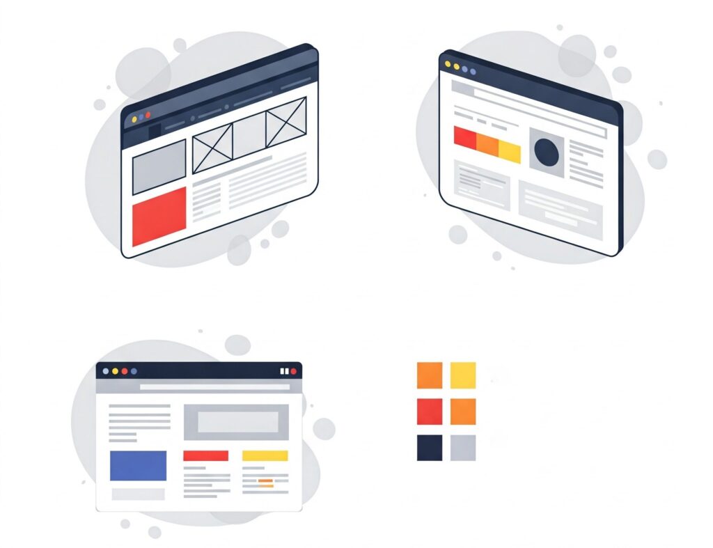
Step 6: Apply the Palette in Prototypes
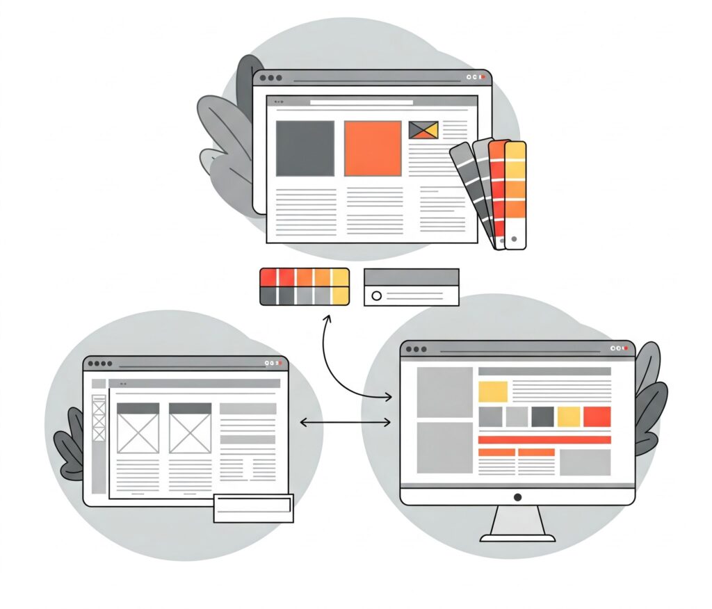
With your color combination finalized, it’s important to see how it performs in context. Begin by applying your chosen palette to wireframes or mockups of your website. This lets you assess how the colors interact with layout elements, images, buttons, and text. Seeing your colors in action helps you evaluate visual balance, clarity, and usability before full implementation.
Pay attention to how different sections of your website look headers, footers, calls-to-action, and product highlights. Are they standing out in the right way? Does the user journey feel natural and guided by visual cues? Evaluate both the aesthetics and functionality of your design using your color choices.
You may discover that certain hues are too harsh on the eyes or don’t offer enough contrast in particular areas. Use this opportunity to refine and adjust your palette. Testing your colors in realistic scenarios ensures that the final product delivers a visually engaging and intuitive experience for every visitor.
Step 7: Gather Feedback and Refine
Even with careful planning, design is an iterative process. Once your prototype is live or ready for review, gather feedback from a mix of users, team members, stakeholders, and even potential customers. Ask specific questions about color perception: Does the color combination feel consistent? Is any section difficult to read or navigate? Are the interactive elements clearly distinguishable?
User feedback provides valuable insights that you might not catch internally. For instance, certain colors may not resonate with your target demographic, or accessibility concerns might arise that require adjustments. Use this data to refine your palette and enhance usability.
This step also allows you to align your visual branding with real-world performance. Brands that continuously test and adapt their design choices often create more impactful user experiences. As seen with legacy brands like Stella Artois, consistency in visual identity builds recognition and trust over time. Regular feedback and iteration are key to maintaining a modern, functional, and emotionally resonant best website color combination.
Utilizing Tools and Resources for best Color Combination
Creating an impactful and visually engaging website starts with choosing the best website color combination. Color plays a foundational role in shaping user experience and guiding how visitors interact with your digital space. As the need for compelling web design continues to expand across industries, the demand for effective and easy-to-use color selection tools is also on the rise. Fortunately, 2025 brings a wide array of innovative design resources that help professionals make thoughtful and strategic color decisions with confidence.
Coolors
Coolors is an intuitive platform that simplifies the process of creating and saving beautiful color palettes. Its seamless interface allows designers to quickly explore a wide variety of combinations, locking in hues that align with their brand identity or project theme. Whether you’re working solo or collaborating with a team, Coolors speeds up the creative process while delivering professional-grade results, making it a great companion when designing visually stunning premium WordPress themes.
Adobe Color
Adobe Color is a dynamic tool grounded in the principles of color theory. It offers features like analogous, complementary, and triadic modes, enabling users to generate harmonious palettes with ease. Designers can experiment with combinations in real time, making it an ideal tool for creating balanced and impactful visuals for any web project.
Canva Color Wheel
The Canva Color Wheel provides a visual method for exploring how different hues interact. By adjusting sliders and viewing real-time combinations, users can better understand the relationships between colors before finalizing their selections. It’s especially helpful for those seeking clarity on complementary, monochromatic, or split-complementary combinations.
ColorSpace
ColorSpace is a powerful online tool designed to instantly generate a variety of color palettes from a single base color. Ideal for both beginners and professionals, this tool provides gradient combinations, matching shades, and related tones that can be easily copied and applied to web projects.
These resources do more than just simplify color picking they help designers craft visually striking websites that reflect clear branding and enhance user experience. According to Venngage, 20% of marketers spend over 20 hours a week producing visual content, emphasizing the importance of effective color strategy in digital design.
Moreover, platforms like UI Faces complement this process by offering customizable avatar sets that match the chosen palette, reinforcing a consistent look and feel across projects. By leveraging these tools, designers can streamline their workflow and confidently select the best color combination for a website that engages, inspires, and converts.
Common Mistakes to Avoid in Color Selection
When selecting colors for your website, avoiding common design mistakes is essential to maintaining a strong visual impact. Overusing too many hues can create confusion and dilute your message. Instead, opt for a well-balanced palette that supports the best color combination for your website, one that highlights key elements and maintains visual harmony.
A critical aspect of color use is contrast. Ensure your text stands out clearly against the background to improve readability and user experience. Tools like AnalogWP emphasize choosing palettes that enhance both the site’s usability and aesthetic appeal. Poor contrast or mismatched hues can disrupt engagement and make content harder to absorb.
Colors evoke emotions and shape perception. Choosing a palette that reflects your brand’s core values helps create a memorable experience for users. A thoughtful combination enhances attention, trust, and interaction.
While trends may be tempting, relying solely on them without purpose can backfire. Your colors should reflect your brand identity and appeal to your target audience, not just follow current fads. As web competition intensifies, especially across platforms like YouTube, a consistent and meaningful color strategy ensures your site stands out. The best website color combination is one that ultimately strengthens recognition and boosts long-term engagement.
Conclusion
Selecting the best color combination for your website is more than just an aesthetic decision it’s a strategic move that directly impacts user engagement, brand perception, and overall user experience. A well-thought-out color palette can guide visitors’ attention, improve readability, and establish a memorable brand identity that resonates with your target audience.
As we move through 2025, it’s important to combine creativity with data-driven tools and practical design principles. From understanding color theory and avoiding common mistakes, to leveraging modern tools like Coolors, Adobe Color, Canva Color Wheel, and ColorSpace, designers now have more resources than ever to create visually cohesive and emotionally compelling websites.
Ultimately, the goal is to ensure your chosen color combination reflects your brand’s personality, connect with your audience, and enhances visual consistency. Whether you’re building a new site or refreshing an existing one, finding and applying the best website color combination can elevate your WP Theme Bundle, helping you deliver a professional, accessible, and engaging digital experience.