Having a solid marketing strategy, a visually appealing website, and a skilled team is important but if your WordPress Site Navigation isn’t up to par, you might still struggle to convert visitors into customers. In today’s fast-paced digital landscape, users expect quick results. They won’t waste time on websites that are difficult to navigate or cluttered with confusing menus.
Smooth navigation is key to helping users find what they need with minimal effort. Whether you’re running a business site or a blog, a streamlined WordPress navigation structure can significantly boost user engagement, reduce bounce rates, and guide visitors toward making a purchase or taking action.
In this guide, we’ll walk you through everything you need to know about optimizing your WordPress site navigation. From organizing menus effectively to adding breadcrumb navigation and improving overall structure, we’ll explore practical steps that can elevate your website’s usability. Stick around to learn how to create a seamless browsing experience that keeps visitors exploring your site longer.
What is WordPress Site Navigation?
Website navigation is the framework that guides users through your website. It includes elements like menus, internal links, and breadcrumbs that help visitors explore your content with ease. Menus serve as the main roadmap, allowing users to access key pages such as Home, Services, or Contact. Internal links enable smooth transitions between related content, while breadcrumb trails show the path users have taken, making it easier to backtrack or understand their current location within the site.
Effective navigation plays a crucial role in delivering a positive user experience. When users can find what they’re looking for quickly and intuitively, they’re more likely to stay longer, engage with your content, and return in the future. In contrast, poor navigation can lead to frustration and higher bounce rates. Whether you’re running a business website or a personal blog, clear and well-structured WordPress Site Navigation is essential for helping visitors explore your site effortlessly.
Why Smart Navigation Matters for Your WordPress Sales Strategy
An intuitive and well-structured navigation system plays a critical role in turning website visitors into paying customers. When users can easily find what they’re looking for, they’re more likely to stay longer, explore your offerings, and complete a purchase. On the other hand, confusing or cluttered navigation can frustrate visitors and lead them to leave your site in search of alternatives.
Your website’s navigation structure includes everything users interact with top menus, sidebar links, footer elements, and even visual design aspects like layout, fonts, and color schemes. Together, these elements shape the overall user journey. Choosing a WordPress theme with sidebar can significantly enhance navigation by organizing content intuitively, while reliable infrastructure ensures your site remains fast, accessible, and responsive—qualities today’s online shoppers expect.
Smart navigation isn’t just about aesthetics it directly influences business performance. Here’s how it supports sales growth:
- It guides users smoothly through your site, helping them discover relevant products or services.
- Easy access to key information speeds up the decision-making process, reducing bounce rates.
- A seamless browsing experience builds credibility and encourages repeat visits.
Up next, we’ll share five proven WordPress Site Navigation tips to help boost sales and keep your visitors engaged.
1. Use Visual Hierarchy to Guide User Behavior
Establishing a clear visual hierarchy is essential to improving how visitors interact with your WordPress site. This design principle focuses on strategically organizing and styling elements on the page to draw attention to the most important areas first. It helps users process content quickly, reducing confusion and making their journey through your website smoother and more intuitive.
An effective visual hierarchy directs users’ eyes to key actions such as calls to action, product highlights, or navigation links ensuring they don’t miss crucial information. By adjusting aspects like size, contrast, placement, and spacing, you can control the order in which elements are noticed and engaged with.
Since mobile users make up a significant portion of web traffic, your design should also remain responsive and visually optimized for smaller screens. In fact, most users are more likely to make a purchase on mobile-friendly websites.
Here are a few tips to enhance your visual hierarchy:
- Use vibrant colors for CTAs (like “Buy Now” or “Schedule Today”) to make them stand out.
- Apply ample white space to separate key elements and improve readability.
Structure your layout to follow natural reading patterns such as the F-pattern or Z-pattern. - Choose a WordPress theme that offers flexible layout controls for customizing your design elements effectively.
By focusing on these visual cues, you help users focus on what matters most leading to better engagement and higher conversions.
2. Add Faceted Search for Better Filtering
Faceted search is an advanced filtering system that lets users narrow down results based on specific attributes such as price, category, size, tags, or custom fields. It’s especially beneficial for WordPress sites with large product inventories or content libraries.
Instead of scrolling endlessly or running multiple queries, users can apply filters to instantly reach the content or products they need. This not only saves time but also enhances user satisfaction and increases conversion potential.
By showcasing filters such as brands, colors, ratings, or categories, you guide users to explore more of your content, often leading them to discover products or articles they hadn’t initially intended to find. Understanding how to add navigation effectively plays a key role in enhancing this browsing experience and improving overall site engagement.
Why faceted search improves UX and conversions:
- Displays relevant filters that match your product or content taxonomy.
- Minimizes frustration by helping users quickly refine their search.
- Makes large content libraries more navigable and user-friendly.
- Encourages deeper site exploration and faster purchasing decisions.
To implement this on your site, you can use plugins like Beaver Builder, which works seamlessly with WooCommerce, Advanced Custom Fields (ACF), and major page builders like Elementor. You can also use technical methods such as JavaScript configurations, canonical tags, and adjustments to robots.txt to optimize performance and indexing.
3. Strengthen Navigation Through a Smart Footer Design
The footer of your website is more than just the end of a page it’s a powerful WordPress Site Navigation tool that appears site-wide. When strategically designed, it can guide visitors to important areas of your WordPress site without requiring them to scroll back up or click through multiple menus.
An optimized footer helps users quickly access key information, especially when they’ve finished reading or scrolling through a product page or blog post. For many visitors, it’s the final opportunity to engage before leaving your site so make it count.
To make your footer functional and user-friendly, include links to high-traffic pages and essential information such as:
- Contact details and your About page
- Frequently Asked Questions (FAQs)
- Terms & Conditions and Privacy Policy
- Return and shipping information (for online stores)
- A homepage link or site logo
- A search bar for quick browsing
Most WordPress themes offer pre-built footer widget areas or footer menus. If yours doesn’t, consider using plugins like Elementor with the Header & Footer Builder addon. These tools let you easily craft a custom footer layout that aligns with your brand and enhances WordPress Site Navigation.
By leveraging your footer space wisely, you create a more complete user experience while subtly boosting engagement and reducing bounce rates.
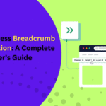
4. Guide Users with Breadcrumb Navigation
Breadcrumbs navigation is a valuable aid that helps visitors understand their location within your website’s structure. Much like the trail of breadcrumbs in the Hansel and Gretel story, these links create a clear path back to the homepage, making it easier for users to explore without getting lost, especially on websites with deep content hierarchies or large product catalogs.
A typical breadcrumb trail might look like this:
Home / Category / Subcategory / Product
Positioned just below your main menu and above the page content, breadcrumbs offer users a quick and intuitive way to backtrack or move between related pages. This eliminates the need to repeatedly use the back button or navigate through the main menu.
In addition to improving user experience, breadcrumbs offer clear SEO benefits. Search engines like Google use breadcrumb data to better understand your site’s structure, which can enhance how your pages appear in search results, sometimes even replacing long URLs with breadcrumb paths.
To implement breadcrumbs on your WordPress site, you have several options:
- Enable them via your theme settings (some themes support this out of the box)
- Use an SEO plugin like Yoast SEO, which includes easy breadcrumb activation and customization
- Add them manually with code (recommended only if you’re comfortable editing theme files like functions.php and template parts)
By incorporating breadcrumb WordPress Site Navigation, you not only simplify the browsing experience for your visitors but also support your SEO strategy making your site easier to navigate and discover.
5. Make Your Search Function Prominent and Powerful
A well-placed, feature-rich search bar can significantly enhance your WordPress site’s usability and keep visitors engaged. While the default WordPress search is functional, it often falls short in delivering precise, relevant results especially for content-heavy blogs or eCommerce stores.
Enhancing your search function with a plugin can transform how users interact with your site. Advanced search plugins like FiboSearch or SearchWP can index product descriptions, tags, categories, custom fields, and more offering users faster, more relevant search results. Features like autocomplete, instant search suggestions, and filters allow users to pinpoint exactly what they’re looking for without frustration.
For eCommerce websites, an effective search can reduce bounce rates and guide users directly to the products they intend to purchase, streamlining the path to conversion. For blogs or knowledge-based platforms, intelligent search capabilities help users uncover helpful content with minimal effort.
Placement is just as crucial as functionality. A search bar should be prominently located commonly in the top-right or top-center of the page, where users naturally expect it. Many modern WordPress themes allow you to customize search bar styles and locations, offering overlays, drop-downs, or full-width display for maximum visibility.
By investing in a standout search experience, you make navigation effortless and ensure users can find value on your site within seconds.
Best Practices for Website Accessibility
Ensuring accessible WordPress Site Navigation is essential for creating a website that everyone can use, including individuals with disabilities. A key step in improving accessibility is using clear and descriptive link text. Rather than vague phrases like “click here,” opt for wording that clearly indicates where the link leads. This gives users a better understanding of the link’s purpose before interacting with it.
Equally important is supporting keyboard navigation. All interactive elements—such as menus, buttons, and forms—should be fully operable using only a keyboard. This is vital for users with mobility limitations who depend on keyboard access. In addition, organizing your content with a logical heading structure helps screen readers and other assistive technologies interpret your site more effectively. By applying these accessibility practices, you not only enhance user experience but also make your WordPress site more inclusive for everyone.
Key Takeaways
Your website should guide visitors effortlessly from one point to another. While users may not always notice well-designed WordPress Site Navigation, they’ll certainly feel the frustration when it falls short.
When your navigation is intuitive and your site functions smoothly, users are more likely to stay engaged and take action—whether it’s making a purchase, signing up, or exploring more content. By applying the WordPress navigation tips discussed here, along with maintaining regular site backups and updates, you can create a more streamlined and user-friendly browsing experience.
Always approach your website from the user’s perspective and craft your WordPress Site Navigation with clarity, simplicity, and ease of use in mind.